The Box Model
The first thing we need to understand is how CSS sizes elements. This is called the the box model, as everything on the web begins as a rectangle:

By default, browsers are set to box-sizing: content-box; which means that the padding (and border) exists outside the content width or height—so padding is then an outset.
But this is often unintuitive and doesn’t fit with most web design patterns, so it is very common (nearly universal) to instead set this to box-sizing: border-box; which makes padding and border exist inside the content dimensions. Then padding is easier to think of as an inset:

Content
The content area is the guts of the element, usually text or an image. Its dimensions are defined by that content, but also can be specified directly via width or height.
Padding
Next comes padding, which extends the element’s area around the content. It’s easiest to think of this as an inset (if we’ve made our box-sizing the logical border-box, above).
Margin
The last part of our box is margin—the space around an element, empty/whitespace area that is used to separate an element from its siblings. Like padding and border, you can specify it all around or on individual sides.
Note that margins collapse, meaning that they are sometimes combined into a single value (the largest) between two elements. This happens most often on adjacent siblings, and is both useful and an absolute pain.
CSS Units
Absolute length units
There are many different absolute units, but only one important one. Use pixles px for absolute sizes.
.my-element {
  height: 360px;
  width: 720px;
}
Relative length units
Otherwise you can use relative units, which depend on and respond to their context.
These are distinctly and intrinsically web measurements.
/* Relative to nearest sized ancestor. */
.my-element {
  height: 90%;
  width: 85%;
}

/* Relative to viewport height/width. */
.my-element {
  height: 75vh;
  width: 80vw;
}

/* Relative to element font-size. */
.my-element {
  height: 1.25em; /* This will be 1.25 times the font-size */
}

/*
  Relative to :root font-size.
  Default :root font-size is 16px, and is rarely changed.
*/
.my-element {
  height: 12rem;
}
Combine them with a calc
Sometimes you might want to use these together! Or otherwise do some math. For this we have the calc function.
.absolute-and-relative {
  width: calc(50% - 20px);
}

.computer-do-the-math {
  width: calc(100% / 12);
}
Limit/constrain them
You’ll often want to set limits/constraints on these values—particularly with flexible, relative units (and responsive design, which we’ll talk about soon.) You can set minimums and maximums using the prefix min- and max-.
.constrained-width {
  min-width: 200px;
  width: 50%;
  max-width: 400px;
}

.constrained-height {
  min-height: 100px;
  height: 100%;
  max-height: 200px;
}
CSS is big and massive and overwhelming and sometimes indefensibly nonsensical—but remember that you can do a surprising amount with just these basic properties! And no matter how complex it gets, it always comes back to these basics.
Position
With an idea of how elements take up space, now we’ll look at how they exist and move together in the document flow. The CSS property position sets this relationship.
Absolute
Absolute positioning is somewhat similar to relative—but instead of placing an element in relation to its own default position, it uses the position of its nearest relatively-positioned ancestor. So it will “go up the chain” of parents and wrapper elements until it finds one set to position: relative;, then uses the same offset properties to move the element around.
Importantly, position: absolute; also removes the element from the normal document flow—meaning it takes up no space in the page layout.
This is often used for exacting, specific design elements.
Relative
The first thing we might want to do is adjust an element from that normal static position, which we can do with relative positioning.
Once you have set position: relative; you can use the top, right, bottom, and left values (with any of the units, above) to move the element away from its default, normal position in the flow.
Static
By default, every element is static—just meaning its normal, stacked position in the document. This is set by default as position: static.
You’ll rarely, if ever, actually set this yourself. It’s the default you change.
Fixed
Fixed positioning also removes the element from the document flow, but it places elements with relation to the browser viewport—the boundaries of the window or device.
So position: fixed; brings the element completely out of the page’s normal flow, like it is sitting on its own separate layer.
This is often used for things like navigation elements.
Sticky
The most recent addition to the position party, position: sticky; elements are placed according to the normal flow of the document, like static, until their nearest scrolling ancestor (usually the viewport) moves past them. The element is then stuck in relation to this element.
This is often used for headers on tables and lists.
Display
In our HTML introduction we briefly talked about block and inline elements, as set by the user-agent styles. These are the first two examples of the display property.
Block
So as we discussed, most HTML elements are block-level by default. But you can also set display: block; manually on an inline element, too. This would mean that it starts on a new line, takes up the full width available, and you can specify a height, width, and use margin above and below.
Inline
And going the other way, you can make block elements switch to inline with display: inline;. They will no longer start on their own lines, will only take up as much space as their content/children, and don’t accept height and width properties.
…but also inline-block
You can also combine the qualities of block and inline with display: inline-block;. These elements take height and width (and vertical margin) like block-level elements, but do not start on their own line.
And sometimes none
Setting display: none; hides an element visually from the document—as well as taking it out of the flow. (Keep in mind the HTML is still there, if someone opens up the source code.)
This is a common way to hide/show (by setting another display property) elements on the page, but it will reflow the document when applied—as if the element is actually added/removed from the DOM.
…vs. Opacity?
Another way to hide an element visually is to adjust its opacity, which uses values on a scale from 0–1. Elements with no (or partial) opacity can still be interacted with.
Keep in mind that display: none; and opacity: 0; only hide things in the rendered browser view. The HTML is still visible in the source code!
Flexbox
The flexible box layout (flexbox) was designed as a one-dimensional layout model.
When we describe flexbox as being one-dimensional we are describing the fact that flexbox deals with layout in one dimension at a time — either as a row or as a column. This can be contrasted with the two-dimensional model of CSS Grid Layout, which controls columns and rows together.
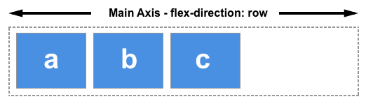
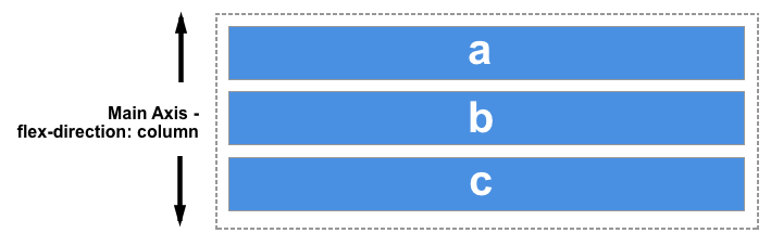
Think about flexbox as a way of ordering elements all within a row or column, one after another. It defines the space relationship as between elements, not beholden to an underlying grid.
Main usage
Let’s say you have a box with two elements inside that you always want to be on opposite ends of each other, no matter how wide the parent is. This is a great use case for flexbox:
It’s pretty simple. You set display: flex; and justify-content: space-between; on the parent container and that’s it. This is a very common practice for menus and interface elements.
Another example might be that you have three elements in which you always want the space between them to be evenly distributed:
This is just as simple, except the property you want is: justify-content: space-evenly;.
Alignment
The two options for flexbox that you will make use of frequently are align-items and justify-content.
These properties will change depending on whether you have the flex container set to flex-direction: row; (default) or flex-direction: column.
Here’s how they work:
| flex-direction | align-items | justify-content |
| row | controls vertical alignment | controls horizontal alignment |
| column | controls horizontal alignment | controls vertical alignment |
So, let’s say you want the items to flow in a row. In that case, align-items will control where the element is positioned vertically within its parent, while justify-content will control how it sits in the horizontal dimension:
And vice versa for when you set flex-direction: column;:
Flex centering
Another very common use for flexbox is centering. For this, you set both align-items: center; and justify-content: center:
I would recommend this as the primary method you use to center things.
Grid
CSS Grid is a more recent and more sophisticated system in which you can create layouts in a much more similar way as you might in design software such as InDesign.
My personal take is that the whole system is too complex and has too many options. However, limiting yourself to the useful options will allow you to make logical grid systems as you might do in your print practice. The following grid is very similar to the one I use every day in my professional practice. It does not have to be complicated.
I’m going to show you the grid system, then we will break it down:
display: grid;:- Specifies that an element should be displayed as a grid container.
- Allows you to create a grid layout and place child elements within it.
gap: 1rem;:- Sets the gap or spacing between grid items in a grid container.
- In this case, it creates a 1rem gap between grid items horizontally and vertically.
grid-template-columns: repeat(12, minmax(0, 1fr));:- Defines the columns of the grid explicitly. The value here is the trickiest part of this.
repeat(12, minmax(0, 1fr)): This part of the property defines the columns in detail.repeat(12, ...)specifies that you want to repeat the following column definition 12 times, creating 12 equal columnsminmax(0, 1fr): Inside each repeated column, minmax(0, 1fr) is used to set the column’s sizing behavior. It sets a minimum and maximum size for the column. The minimum size is 0. This means that even if there’s no content in the column, it won’t collapse to nothing; it will always have at least zero width. The maximum size is1fr. This is where the “fr” unit comes into play. It represents a fraction (fr) of the available space in the grid container. In this case, it means that each column will take up an equal fraction of the available horizontal space, dividing it evenly among the 12 columns.
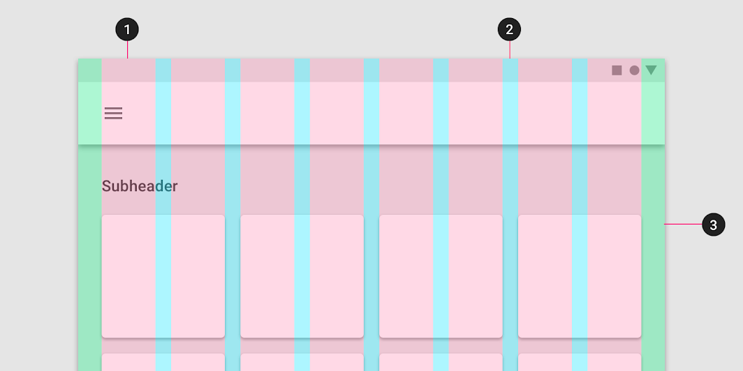
padding-left: 1rem;andpadding-right: 1rem;:- Adds 1rem (16 pixels) of padding to the left and right sides of the grid.
- While this isn’t part of the grid explicitly, it creates the gutters to the left and the right of the grid that ensure even spacing all around:
On the columns themselves, you’re simply specifying how many columns the element should span across:
grid-column: span 6;is a CSS property that is used within a grid layout.- instructs an element to span across a specific number of grid columns.
- in this case,
span 6means the element should extend and occupy a total of 6 grid columns.
In the example, I used a few different column span classes to vary the widths of the columns for a dynamic layout.
CSS Grid is a very deep rabbit hole. If you want to get deep into it, check out this guide: CSS-Tricks: CSS Grid
The 12-column grid system
There is a pervasive pattern in web design for grids to be 12-columns.
The concept of using a 12-column grid system in web design can be attributed to the work of Mark Boulton and Khoi Vinh. They played a significant role in popularizing this approach. Mark Boulton introduced the idea of a 12-column grid in his 2007 book “Designing for the Web.” Khoi Vinh, a designer and writer, also advocated for the use of a 12-column grid system and wrote about its benefits in his blog.
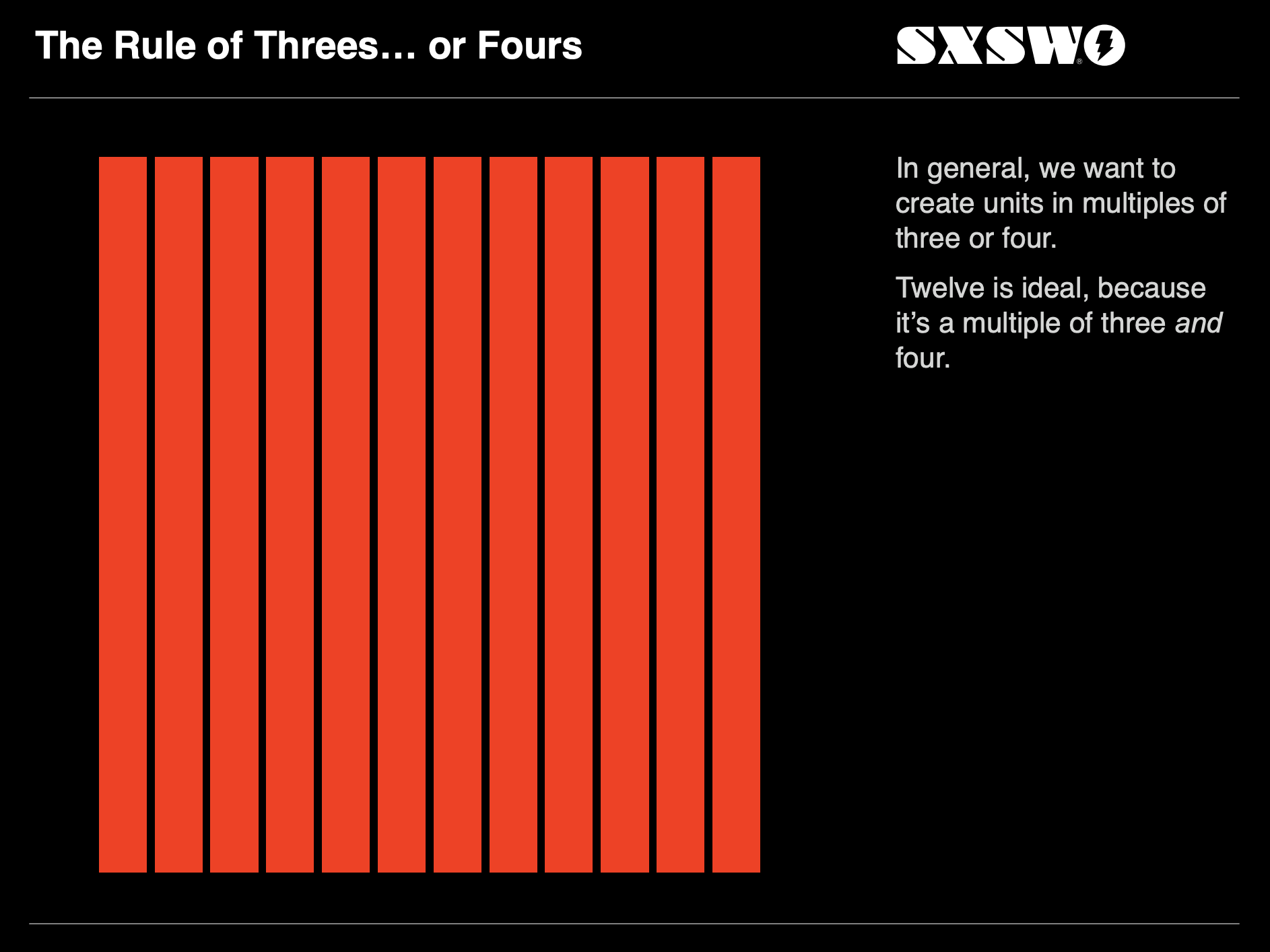
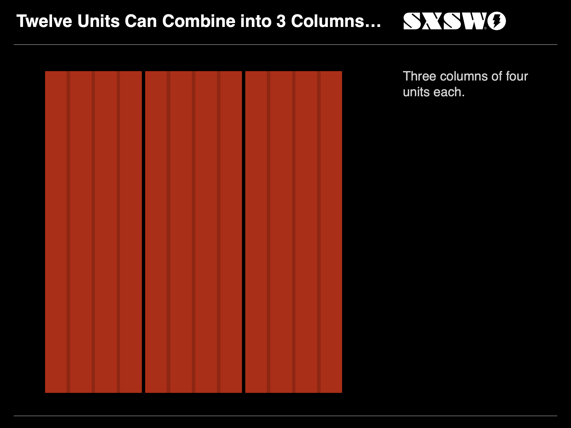
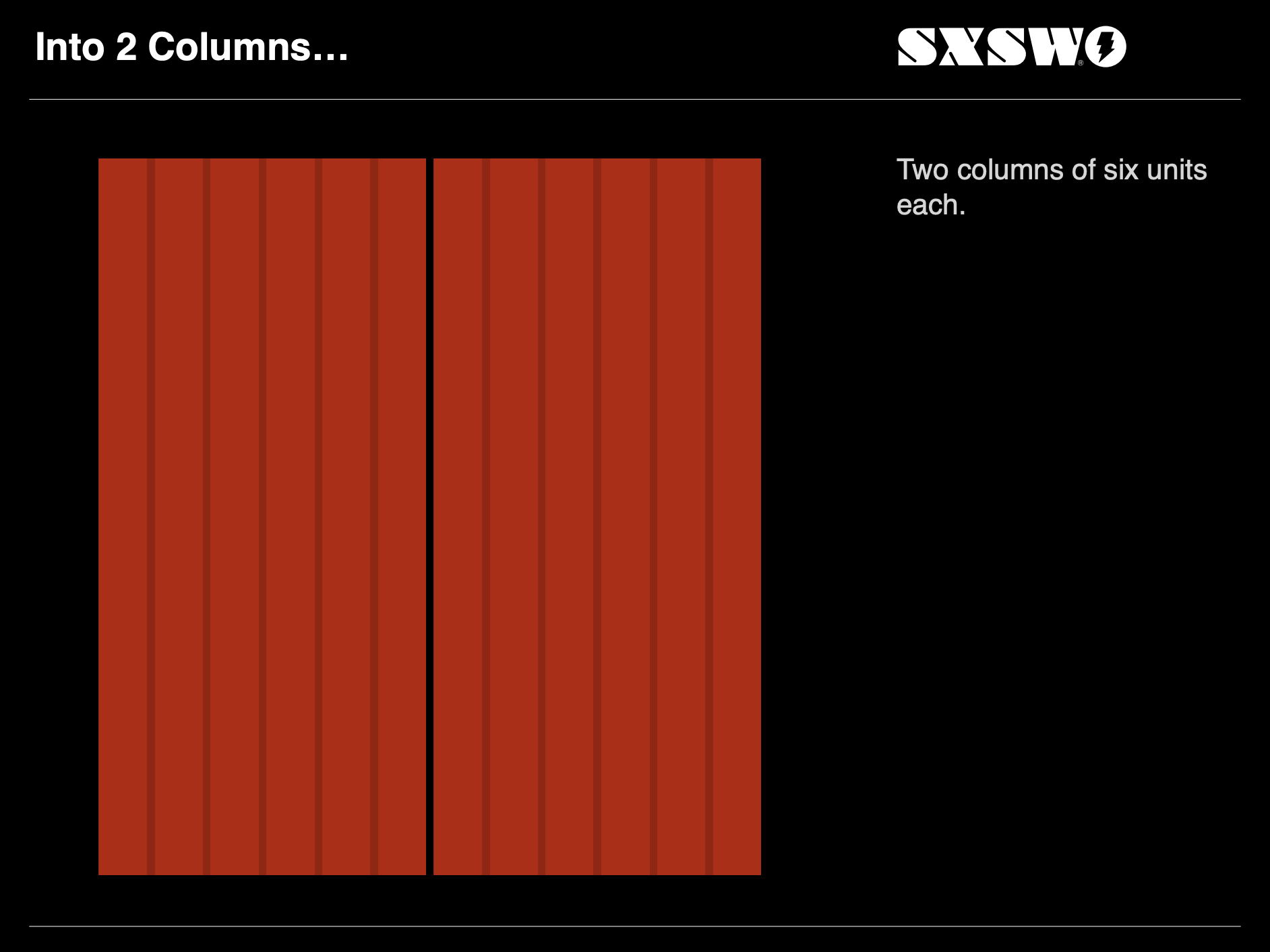
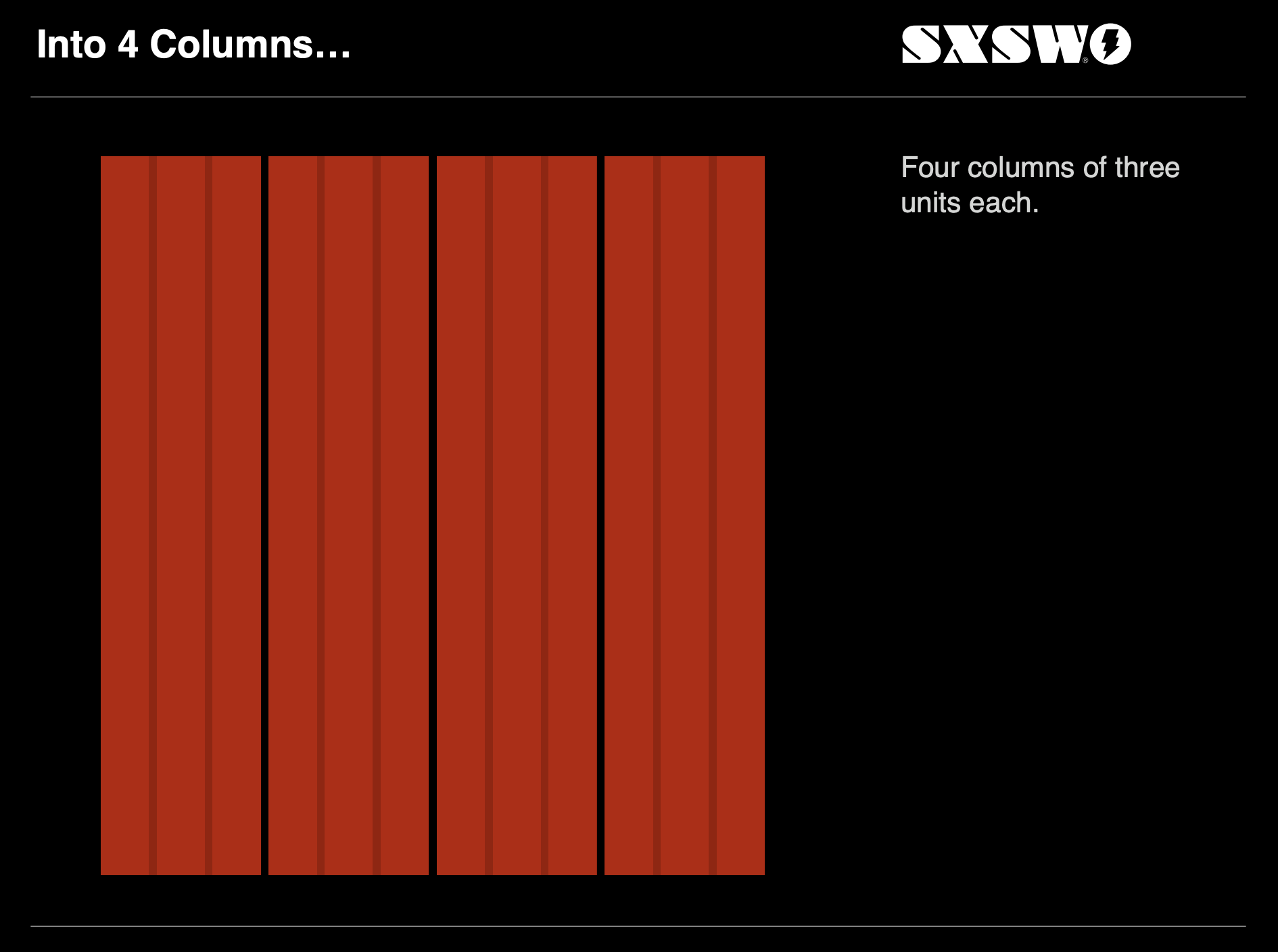
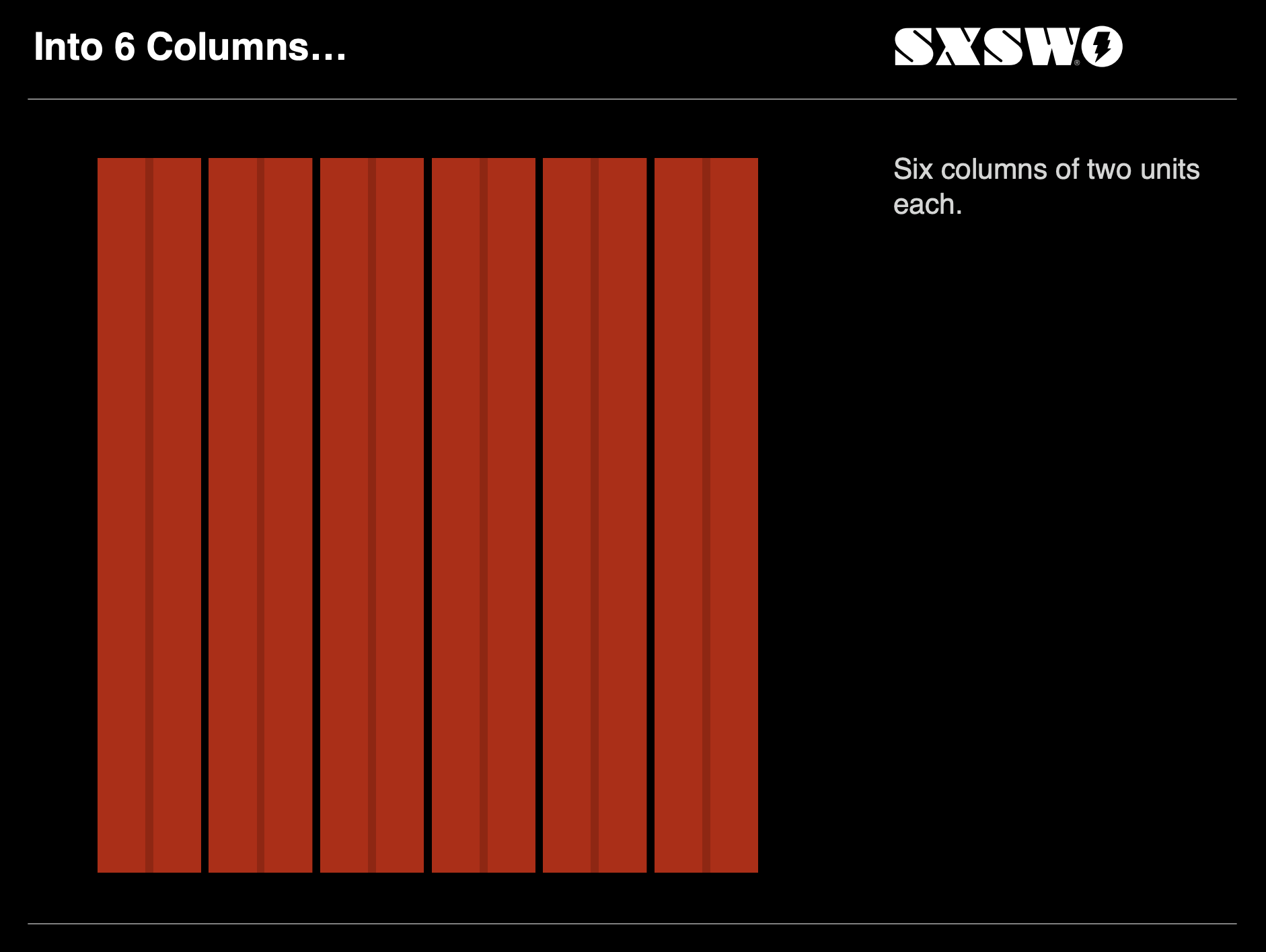
A 12-column grid can be easily divided into halves, thirds, quarters, and other common fractions, making it convenient for designing complex layouts without complex calculations.
If you’re curious, check out this presentation from around the time the concept was introducted.
This concept was further entrenched into digital design by the popular framework Bootstrap. Bootstrap is an open-source front-end framework developed by Twitter that has become immensely popular for web development.
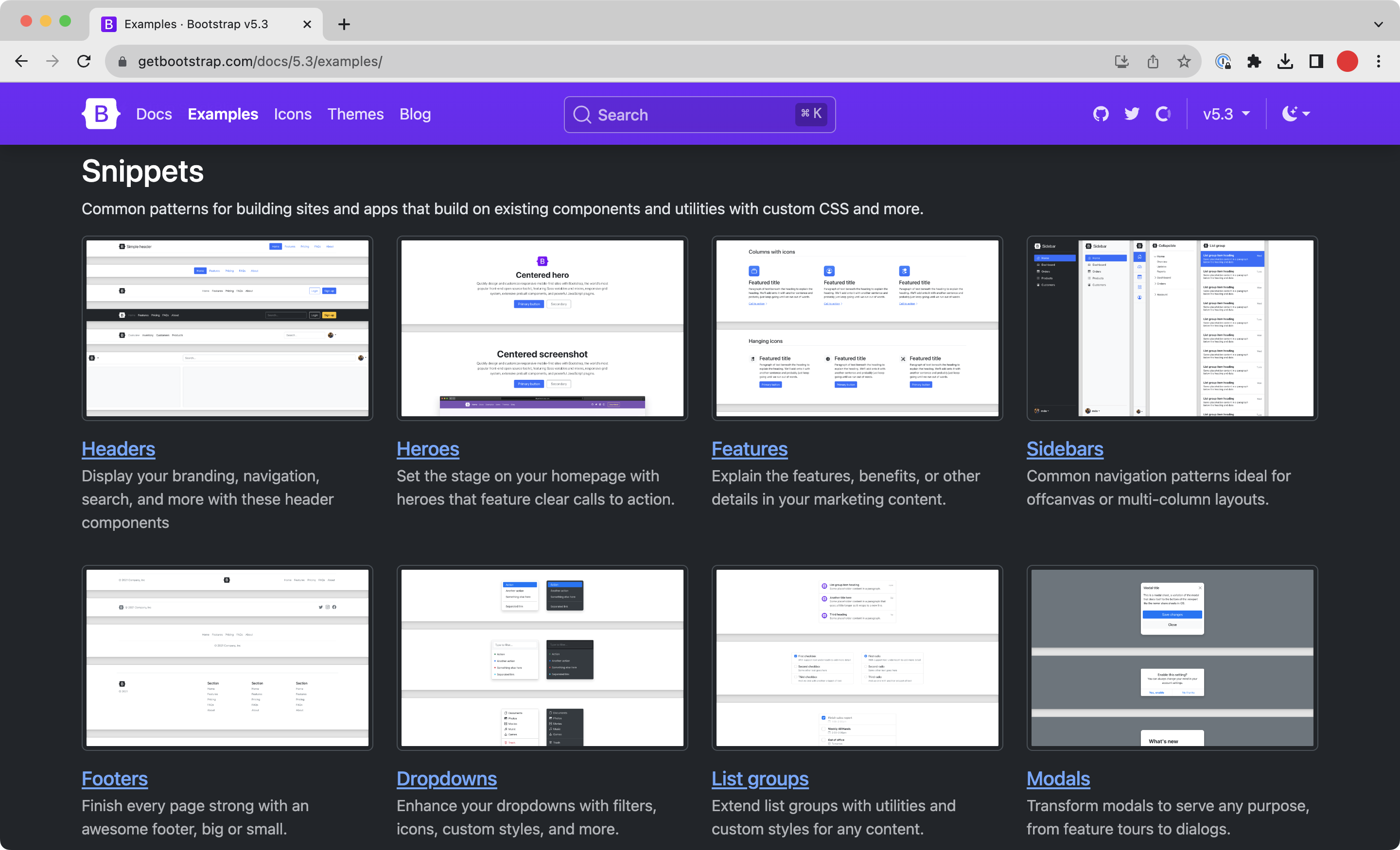
It is essentially a large kit of pre-built web components that many software companies use for their own products. It is important for many reasons, but its use of a 12-column grid system is one of its defining features.
Flexbox or Grid?
I tend to think of discrete elements as use case for flexbox (such as having a div in which you want something to be centered), while the underlying system of the site’s layout is governed by grid:
Choose what makes the most sense to you. You may find that flex or grid speaks more to you and you only use one or the other. All up to you!
Part of this lecture was originally written by Michael Fehrenbach.